- add div borders
- create glow effects
- shadow effects
- brainstorm other effects
- side by side images
- complete the quick reference table
- ToC?
- explain fixed vs variable values for width (400px vs 35%)
- further sepperate the basic/complex functions into sepperate sections for different user types.
- Spelling / Grammar check
- Overall Layout and asthetics.
dg-publish: true
Advanced Flags and Customization
This section contains some of flags that are set up for those who want to further customize their snippet. These are optional and are not included in the main list due to the requirement of tweaking and the need for some CSS understanding or for their complexity which can cause confusion or information overload.
While the normal flags can be used "out of the box" or with some minor setting changes, these are a bit more involved.
Advanced Borders
Rounded Corners 2: Electric Boogaloo

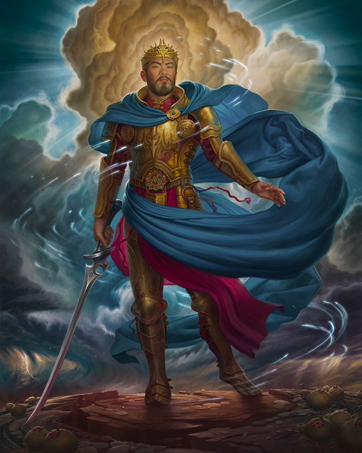
I wanted to have a little extra fun with border radii. These will set a rounded corner on a single corner. These can be used individually or in pairs. As always feel free to modify the values to fit your needs.
- Top left corner: -bradiustl
- Top right corner: -bradiustr
- Bottom left corner: -bradiusbl
- Bottom right corner: -bradiusbr
Borders for Portrait/Landscape
Having a clip path will also clip any border. Putting a border on the span will create a square border around the box rather than an elliptical shaped one.
The way to accomplish a border effect for these is to set the span background color to the desired color then apply a border to the desired thickness.
I have the spans already set up this way by default so changing the background color with a flag will do the trick. You can also change the span border with a flag as well.
Other Border Settings
Border settings can be modified in the default values in the CSS, or they can be overridden by an additional flag. The following can be used to override the default settings.
"-bsizethin" - Sets the border size to 1px
"-bsizethick" - Sets the border size to 5px
"-bdotted" - Sets the border to a dotted line #WiP
"-bdouble" - Sets the border to a bouble line #WiP
"-bcolor1" - Sets the border to a preset color (default: White) #WiP
"-bcolor2" - Sets the border to a preset color (default: Red) #WiP
""
Custom Presets
There are several places where custom settings can be employed along with the standard options. These fall into the same two categories as the normal flags: Core Flags and Modifier Flags.
Custom Core Flags
- These start with a "+" and work just like other core flags.
- Allow a user defined set of defaults as templates
- designed for settings that the are used the most often.
- Modifiers (both standard and custom) can be applied
- "+custom1" and "+custom2" included
- More can be made with copy/paste and increasing the number
Custom Modifier Flags
- "c" added as prefix to standard modifiers
- Can be applied to both standard and custom Core Flags
- One Custom modifier included for each type.
- More can be made with copy/paste and increasing the number

Here's an example of the standard "+hr" element with a standard modifier (-divborder2) and two custom modifiers (-cwidth1 and cdivbradius1) The custom width is set to 120% so that it extends out beyond the text and includes a negative 10% margin on the left so that the bar is centered. The custom border radius make a much more rounded end.
Images side by side and other arrangments
 If you want two images side by side, you can place them one
 after another on the same line. If they are sized so that their combined width is less than that of the page, they will display inline. The text will still flow around the images since they are floated to the side.
if images are on the right hand side, the first image is the furthest right, while the last one will be furthest left.
Fixed and Abolute
"-fixed" will cause the image to become fixed so that it will not move as the page undernieth scrolls
"-abs" will cause the image to be positioned the same place regardless of where it is put in the edit mode.
No Float Tag


You may want two (or more) images side by side of differing sizes then wish the text to not flow around one or more of them. You might want other elements not to flow around an image.
Enter the "-nofloat" tag. The first image is floated right (larger image) allowing both the second image and the text to flow around it. The second image (smaller image) is not floated causing the text to start on the next line.


You can use "-nofloat" on the last image in a line to end floating. Note that this will cause the last image to left align which can look odd depending on the size of image. (above is an example of this as it causes the middle image to appear too far to the right). If you had only two images, though, it would look OK)


In many cases, it is better to use the "< br>" command to create line returns so that the text starts on the correct line.
Grid View
 When obsidian changed from having the images inside a block level element to a special



Quick Reference
| tag | type | description |
|---|---|---|
| +side | core | default flag, floats to right |
| +tape | core | image taped to background effect |
| +pin | core | image pinned to background effect |